
LTA Tax Academy
Redesigning an e-learning platform around the student journey.
A platform built for professional learning
LTA Tax Academy provides professional tax courses and certifications for Latin American accountants living and working in the United States.
The existing platform was built with WordPress and combined the marketing experience with the student classroom. As the platform grew, this created friction for both students and the internal team.
Marketing
- Landing pages
- Course catalog
- Blog & SEO content
- Sales CTAs
- Promotions
Learning Platform
- Student dashboard
- My courses
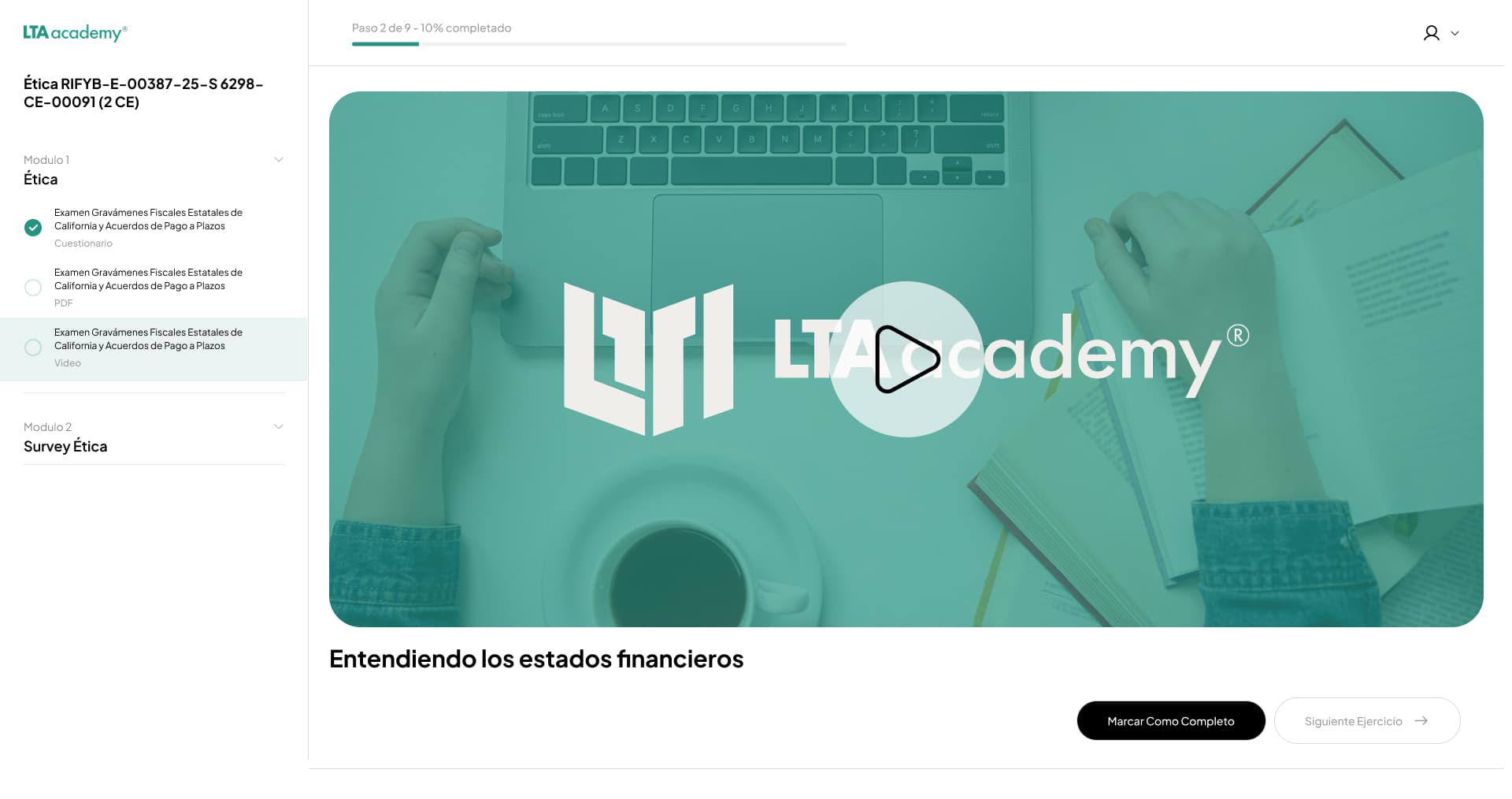
- Course player
- Certificates
- Progress tracking
Students couldn't find what they needed. The platform wasn't built around their goals.
Students weren't struggling with learning.
They were struggling with the platform.
Support tickets, course surveys, and stakeholder feedback revealed recurring problems across the student journey.
Find my course
Students struggled to find courses they had purchased or discover new ones.
Continue learning
There was no clear path to resume a course they had already started.
Use the platform
Slow performance, responsive issues, and WordPress limitations created additional friction.
Support tickets per day — recurring, platform-related issues.
Average course satisfaction score, indicating broader dissatisfaction with the experience.
Typical membership duration before students churned from the platform.
Understanding the experience before redesigning it
The design process started with understanding the existing product rather than immediately creating new screens.
Existing platform evaluation
Evaluated the current platform to identify usability, navigation, responsive, performance, and content-structure problems.
Customer support tickets
Support tickets revealed recurring problems around finding courses, continuing courses, and platform performance.
Course surveys
Course feedback averaged approximately 2.5/5, indicating broader dissatisfaction beyond isolated issues.
Stakeholder conversations
Worked with the business and technical teams to understand student problems and internal operational constraints, including difficulties managing courses in WordPress.
Technical team discussions
Early engineering collaboration helped surface platform constraints that directly shaped design decisions.
Competitive research
Reviewed established e-learning platforms to understand how they structure learning environments, course discovery, progress, and retention-oriented experiences.
The platform was trying to serve two different goals.
- Acquire
- Promote
- Sell
- Discover
- Learn
- Complete
- Access certificates
The existing platform mixed marketing and learning into one experience. This created unnecessary competition for the user's attention.
Key Product Decision
Separate the marketing experience from the learning platform — so each can serve its own goal without competing for the student's attention.
Reduce cognitive load.
Improve focus and retention.
This became the main design principle for the new learning experience. Every major decision was evaluated against three questions.
Can users understand where they are?
Can users quickly find what they need?
Can users continue learning without unnecessary friction?
The goal was not to add more features, but to make the existing learning journey easier to understand and navigate.
Designing with engineering from the beginning
Before detailed execution, I worked with the technical team to understand the limitations of the existing WordPress implementation and evaluate a more flexible custom platform approach.
The goal was to create a platform that could be easier to maintain, scale, and evolve — not just a reskin of the existing structure.
From a complex website to a focused learning platform
The new platform was organized entirely around the student's primary tasks.
Core Navigation
All Courses
Discover available courses.
My Courses
Continue courses already purchased or started.
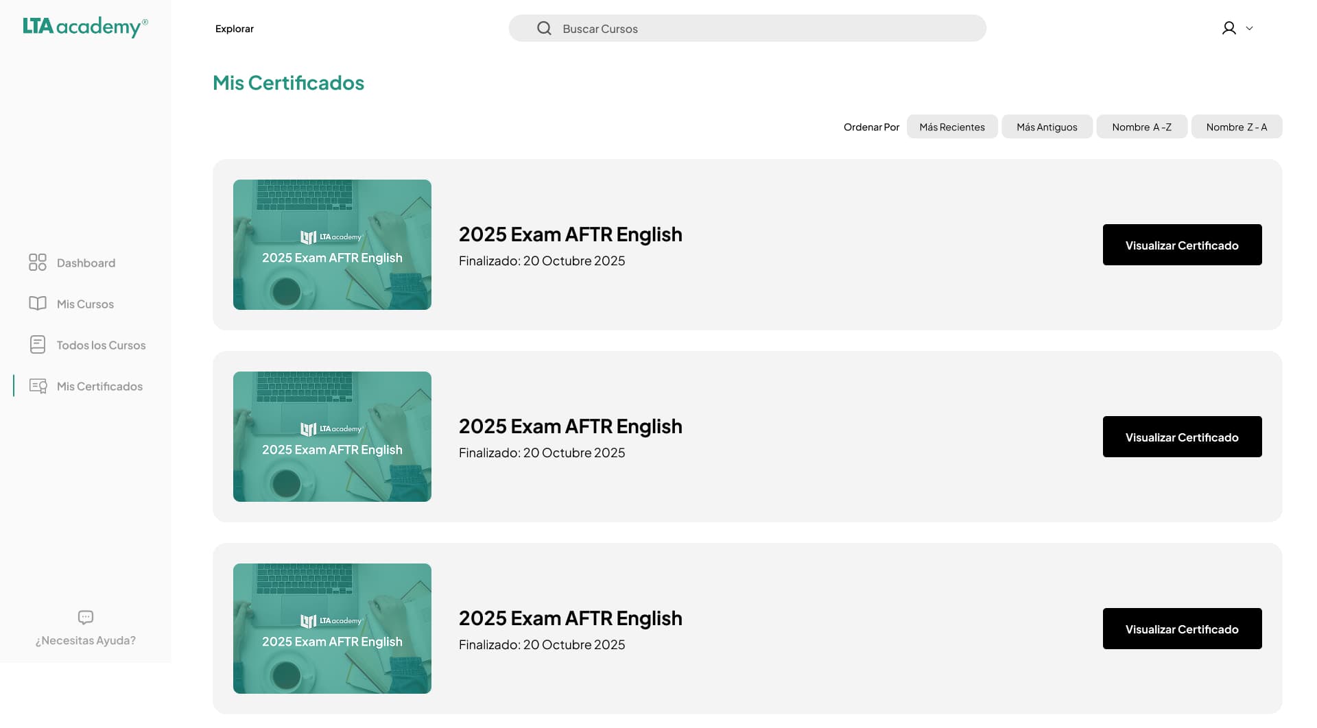
My Certificates
Quickly access completed certifications.
Main Learning Journey
Making the learning path easier to follow.
Each step in the journey was designed to reduce uncertainty and cognitive load — so students could focus entirely on learning, not on navigating the platform.
Designing around the student's primary tasks.
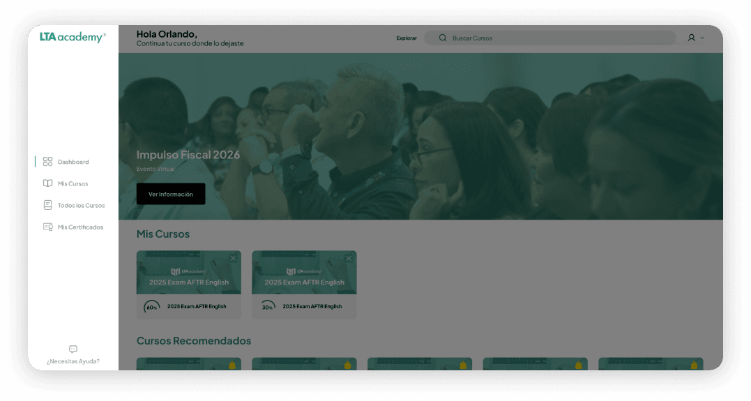
Clear navigation
Problem
The original navigation mixed marketing links with platform tools, making it hard for students to orient themselves.
Design Decision
A simplified navigation structure makes the student's primary tasks immediately visible — no hunting, no confusion between catalog and personal library.
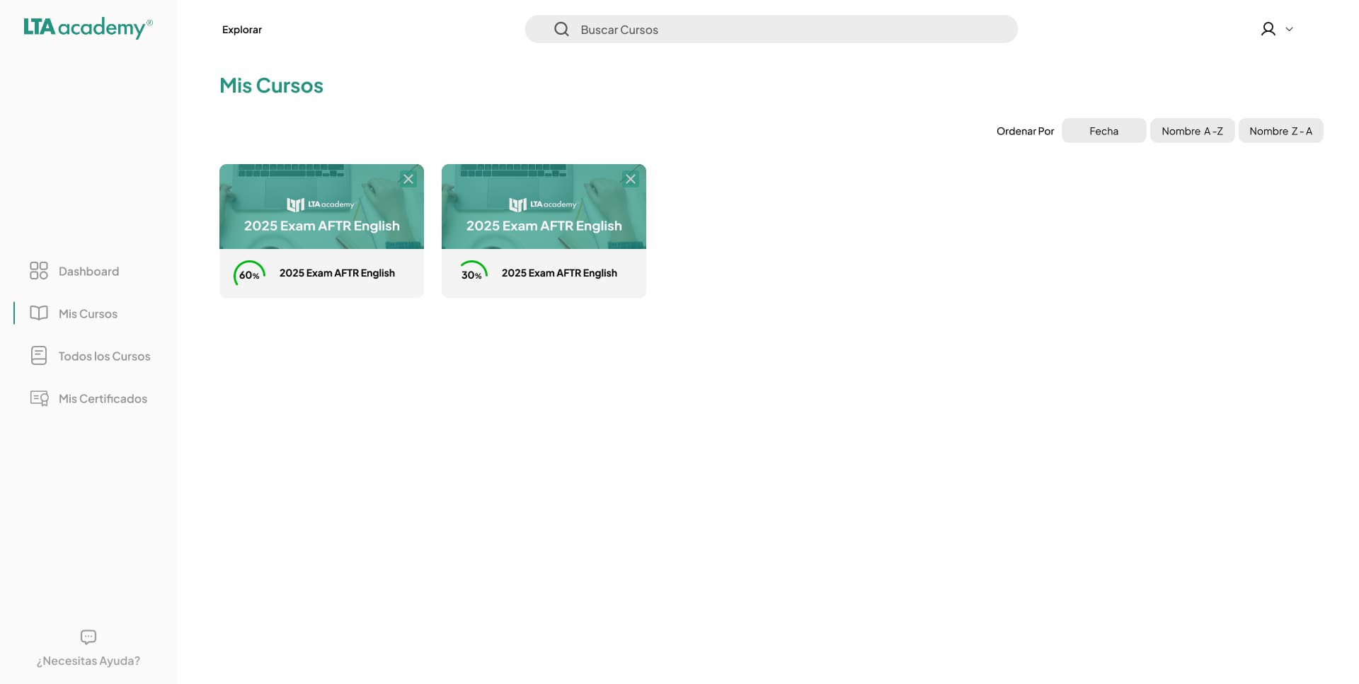
My Courses — Continue Learning
Problem
Students who had purchased courses had no clear, dedicated place to resume them. They had to search through the platform.
Design Decision
My Courses provides a dedicated space for continuing learning — the most frequent student task — always visible from the main navigation.
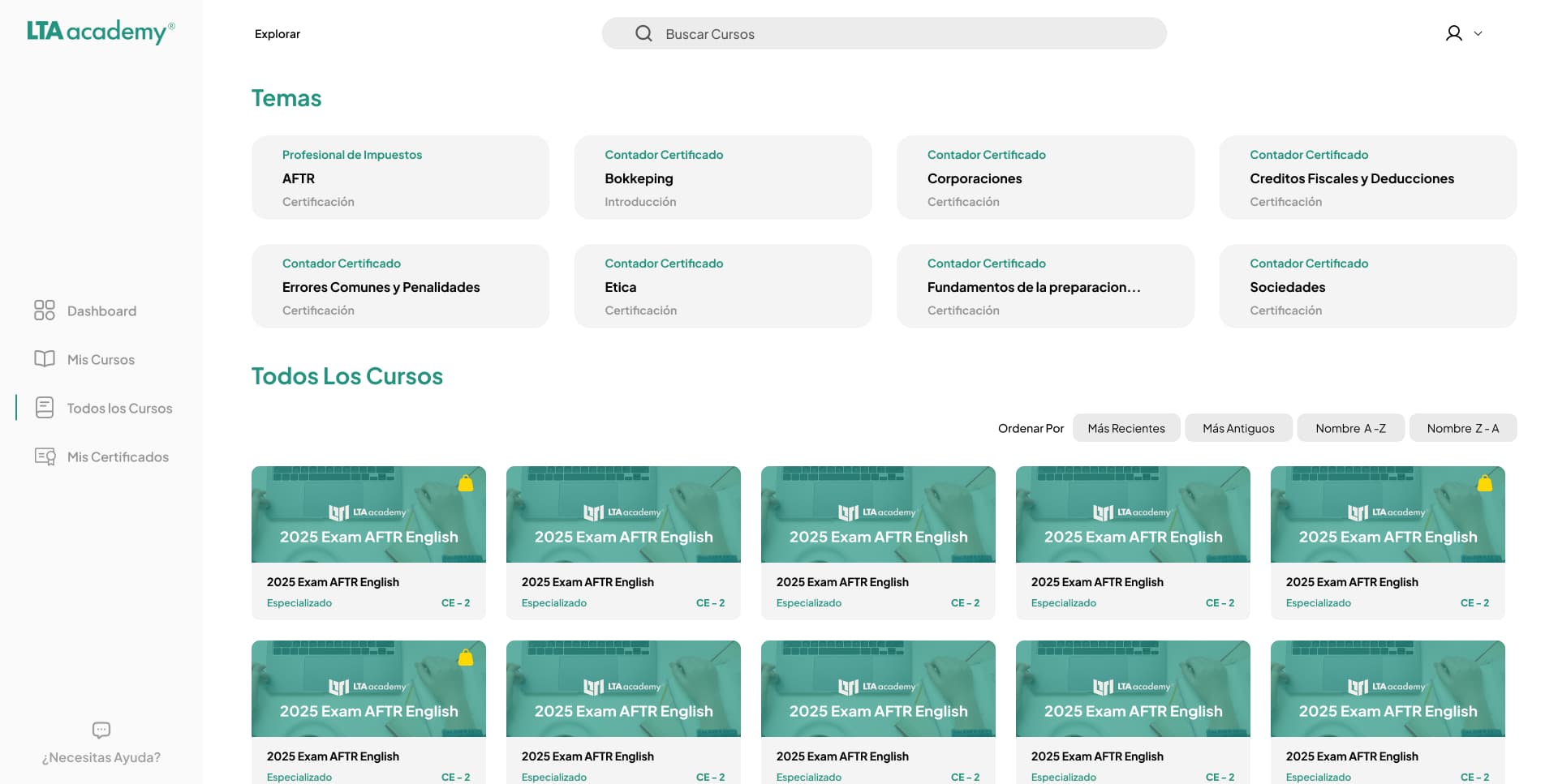
Course discovery
Problem
Course catalog and personal library were mixed together, creating confusion between 'courses I can buy' and 'courses I own'.
Design Decision
All Courses creates a clear entry point for discovering new learning opportunities, visually distinct from the student's personal library.
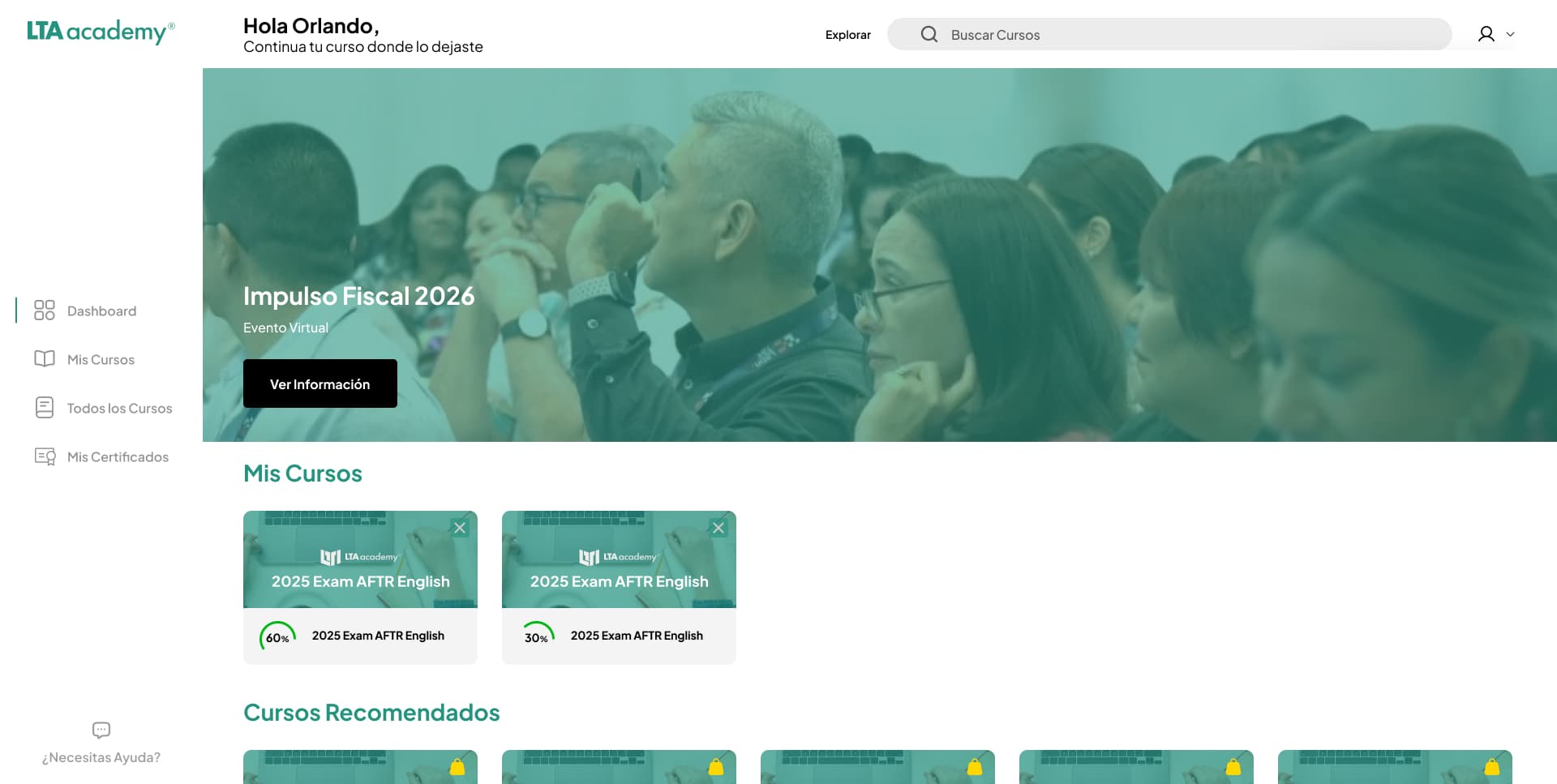
Focused learning dashboard
Problem
The student dashboard was buried among marketing content and promotional banners, making it hard to focus on actual learning.
Design Decision
Separating the platform from marketing content allows the dashboard to prioritize what matters most — the student's current progress and next steps.
Certificate access
Problem
Students had no clear way to quickly access, download, or share their completed certificates — a key value moment of the product.
Design Decision
Certificates are surfaced as a primary navigation item, giving students immediate access to their proof of learning completion.
A system designed for clarity and consistency
The visual system was built to support a focused learning environment — not to impress, but to disappear into the content.
Aa
Plus Jakarta Sans
A modern, highly readable typeface selected to support clear hierarchy and a focused learning environment.
Base
#0a0a0a
Surface
#ffffff08
Primary
#249480
Primary dim
#249480/20
Text
#ffffff
Iconify
Used to provide a flexible and consistent icon system across the platform.
The new learning experience
01 — Dashboard
02 — My Courses 03 — All Courses
04 — Platform Overview
05 — Course Detail 06 — Navigation
From friction to measurable improvement
The redesigned experience reduced friction across the core student journey while improving satisfaction and supporting stronger membership retention.
5–7 tickets/day → ~5 tickets/week
Reduction in recurring platform-related support requests.
2.5/5 → 4.0/5
Improvement in average course satisfaction score.
Increase in students maintaining their membership after the redesign.
Current conversion rate after the new learning experience.
Results are observed outcomes after the redesign. Multiple factors contribute to platform performance; correlation should not be interpreted as direct causation.
What I learned
This project reinforced that improving a product is not always about adding functionality. The biggest opportunity was simplifying the experience around what users actually came to accomplish.
Separating marketing from learning and restructuring the platform around the student's core tasks created a more focused and scalable product experience. The project also reinforced the importance of involving engineering early when product architecture and UX are closely connected.
Next project
Back to portfolio →